Let’s Stop Pretending Alcohol Has Health Benefits.
Welcome to Matt’s Mix Tape: A steady beats approach to midlife fitness, writing, and mindset.
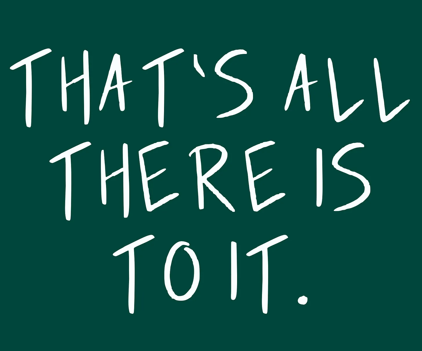
Welcome to the final Mix Tape. This is it.
Am I being overdramatic for cheap attention? Absolutely!
The newsletter will continue, but under a new name. I’m also in the process of moving my personal website off of Squarespace and into Substack.
I’m going all in on this platform.
Oh, and there’s a new color palette, also, which I’m test-driving today. Courtesy of a color creation process I learned from Nate Kadlac in his Approachable Design course, I’m moving from Gulf Coast Blue to something I call Steady Green.
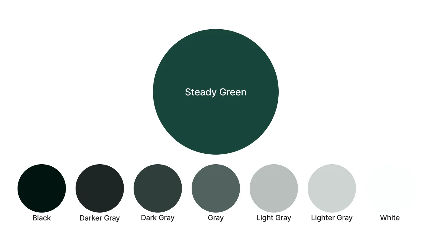
Future editions of this newsletter will be called “Steady Beats.” I’ll share the reasons why next week.
It’s time to shake things up, again.
And while those changes are brewing, here are some useful things I read and did this week.
Let’s stop pretending alcohol has health benefits.
I could link to Brady Holmer’s Physiology Friday newsletter every week. It’s well-written, well-researched, and so uninterested in supporting the Twitter health fad of the moment.
In fact, Brady seems to relish destroying those fads, lightheartedly trolling as he deals in facts—not what we wish was true.
Recently Brady examined whether moderate drinking really has health benefits. He finds that most of the alleged health benefits of alcohol — like resveratrol in red wine, for example—are flimsy claims at best, false at worst.
I don’t advocate for teetotalling, unless you want to, of course.
Life goes by fast. I like a cocktail here and there. But let’s drink with eyes open. We’re not benefiting ourselves physically in any way when we imbibe.
Improving your Google Docs experience
If you’re like me and spend a retina-melting amount of time in Google Docs, here’s something to make it a bit easier and more enjoyable to use.
This week Nate Kadlac shared the ultimate guide to creating a “Zen-like experience” in Google Docs. Lots of tips to make Google Docs look better and more tailored to your personal tastes, as is Nate’s way.
I’m a big fan of “Pageless.” mode, which melts away the traditional 8.5” X 11” page view. It’s odd how freeing it feels. And if you’re using tables, they get much-needed room to stretch out.
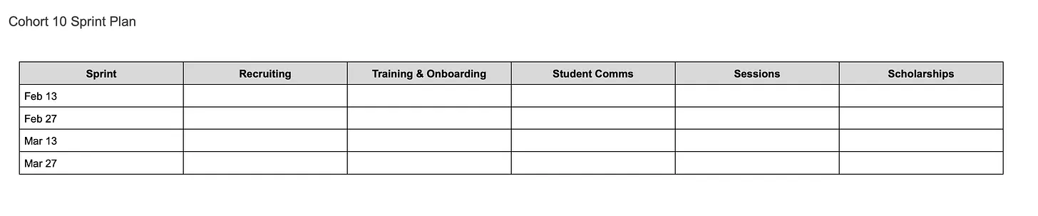
So. Much. Table space.
Creating your own handwritten font
It’s absurd how easy this is—and it’s free.
If you use Procreate on the iPad to draw, it can be a pain to draw letters over and over again.
No need.
Just follow the simple steps in this video:
I uploaded this template to Procreate and drew letters inside the boxes:
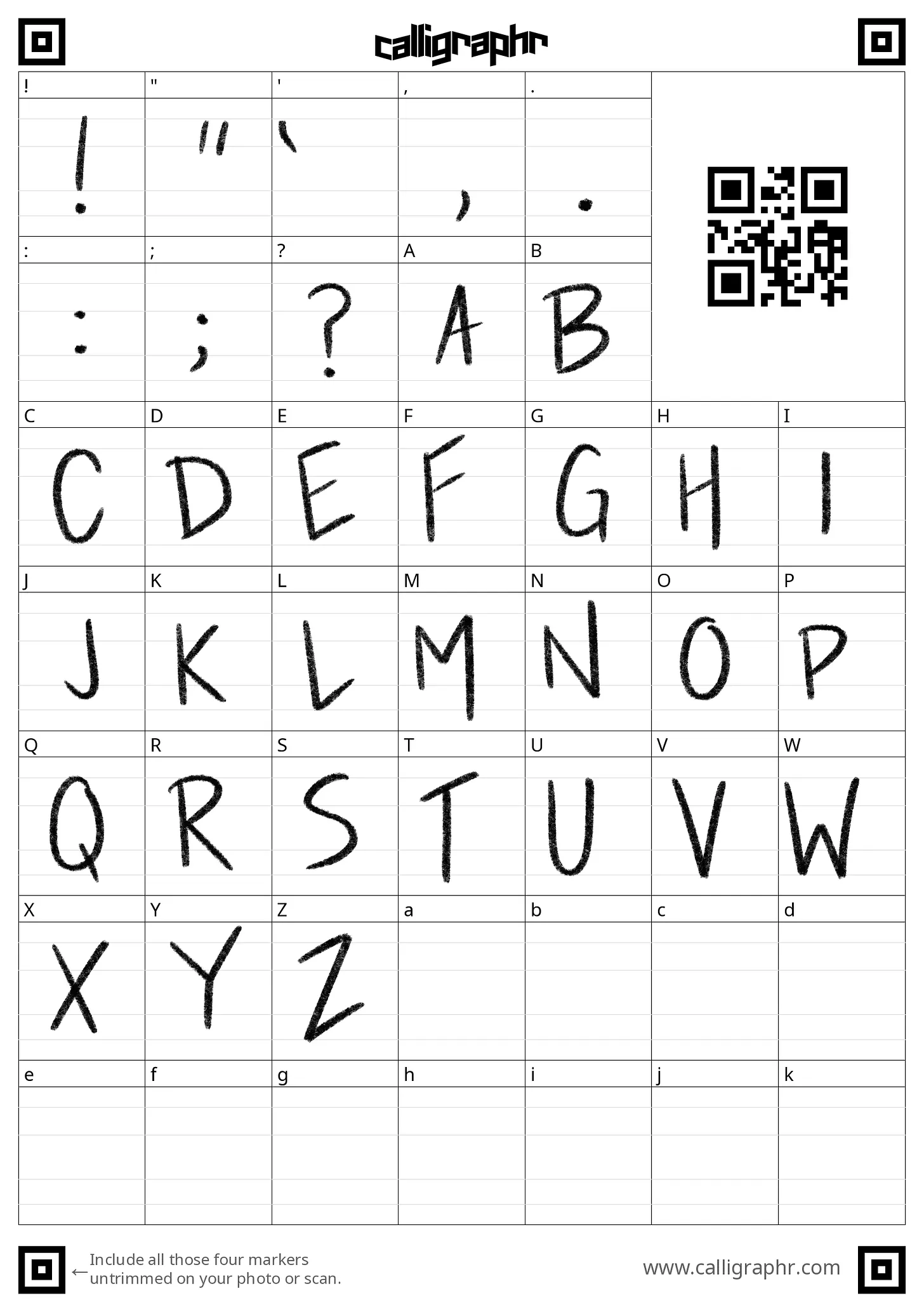
Then I uploaded the sheet to Calligraphr, followed the steps to the create font file, and installed it to Procreate.
Thank you for reading.
Let’s keep the steady beats going right through 2023.
If you liked this edition, would you mind giving the heart a click? Thank you.
Archived from Matt's newsletter.